Swiss Wine Promotion unveils new visual identity
ZURICH, SWITZERLAND – Swiss Wine Promotion (SWP), the marketing arm of the wine industry, unveiled its new graphic identity in Zurich 20 May, laying the groundwork for what everyone in the Swiss wine business is keen to hear: a clear strategy to promote Swiss wines.
The SWP was created in 2006 after its predecessor, Swiss Wine Communication, was declared bankrupt. Its members are the six wine regions’ promotion boards and other industry bodies.
The fresh start that wine producers were hoping for didn’t materialize immediately in 2007, with its president, Jacques-Alphonse Orsat, failing to garner strong support that would outweigh the traditional tensions and competition between cantons.
He was replaced by Gilles Besse in 2012 and in 2013 the non-profit association (which receives some government funding and money from its members) was moved from Bern to Geneva and the SWP began to develop new partnerships.
Marketing ventures abroad were stepped up to improve the visibility of Swiss wines and at home, for example with Vinea for Swiss Wine Week, to encourage consumers to explore wines from more regions.
Neck bands will be first clue wines are Swiss
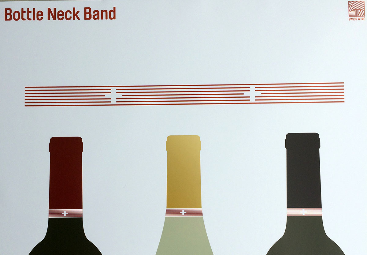 Besse and the SWP’s director, Sébastien Fabbi, have said little publicly about their broader and long-term strategy for increasing the very low profile of Swiss wines abroad, but Besse told me at the graphic identity presentation that a first step will be to insist that AOC wines use the new neck band with its subtle Swiss cross that is part of the identity kit. They won’t be obliged to use the SWP logo, however.
The cantons accepted the new logo “at the director level”, he says, but German-speaking cantons wanted the Swiss cross.
The neck band could help ease these complaints. Tyler Brûlé, founder of Winkreative, the agency behind the new graphic identity, told journalists that “the cross is still in there, but it doesn’t overpower. There’s a real strength in a band, that will make it [Swiss wine] stand out.”
It allows cantons a degree of autonomy, he added, a nod to the ever-present political reality of Swiss de-centralization.
The next stage of the process is a revised web site and an advertising campaign that will kick off in the autumn. Promote Chasselas as the national wine or not has been part of the debate; in describing Swiss wines at last week’s press conference Chasselas was given pride of place, a clue. Details for the ad campaign are not yet out but the logic of starting with new branding was provided at the press conference last week:
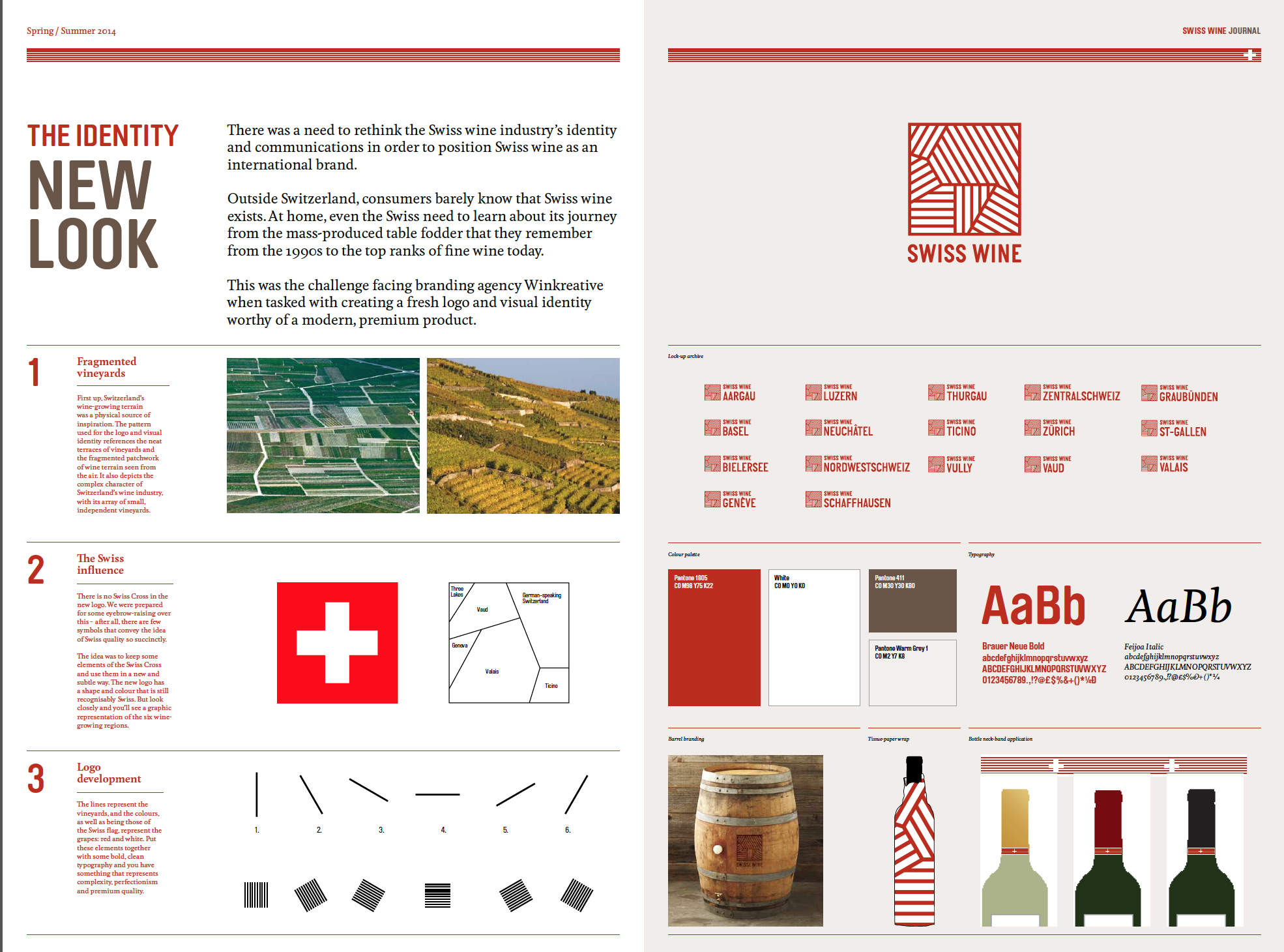
“There was a need to rethink the Swiss wine industry’s identity and communications in order to position Swiss wine as an international brand. Outside Switzerland, consumers barely know that Swiss wine exists. At home even the Swiss need to learn about its journey from the mass-produced table fodder that they remember from the 1990s to the top ranks of fine wine today.”
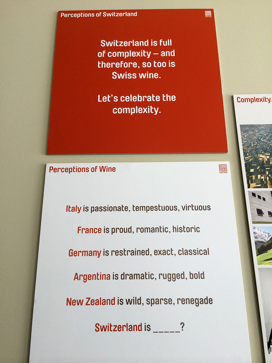
Swiss message for exports or local for home market?
Swiss wineries for years have been debating the pros and cons of identifying their products as “Swiss wine”: with well under 2% of total production exported, some argued it made little sense and would clutter the bottle. Crucial home markets are interested more in knowing about the canton, town, winery and grapes, in addition to the wine itself, was the thinking.
Others, notably wineries that export, have fought to get “Swiss wine” onto labels, maintaining that if consumers outside the country don’t see this and make the connection with Swiss quality, the wines don’t have a chance. Until now, there’s been no uniform identity for producers to use, other than a Swiss cross and the words “Swiss wine”.
The Interprofession de la vigne et des vins suisses (IVVS) said last year in a position paper that it wants to see exports rise to 5% by 2020, Pierre-Emmanuel Buss, journalist for Le Temps, wrote after accompanying a wine promotion trip to Japan in September 2013.
Consumption has been slipping at home – until last year – and that may be helping wineries become more comfortable calling their wines “Swiss” as they consider new markets.
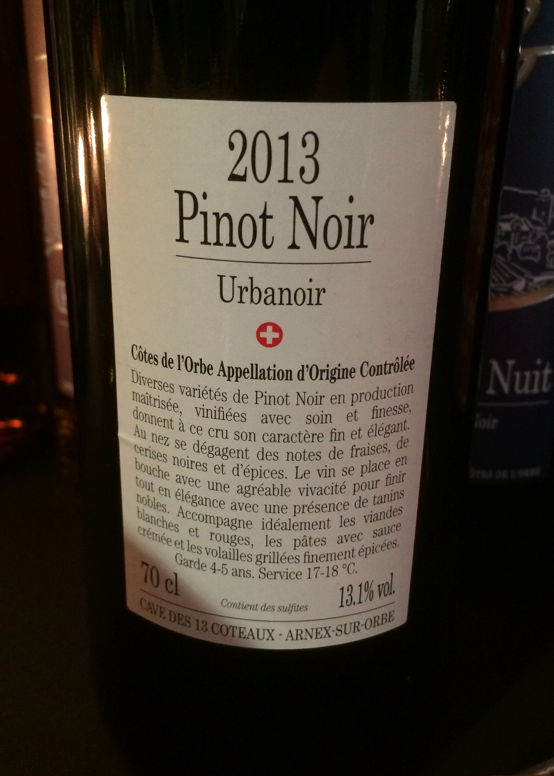
A small cooperative of 17 members, the Cave des 13 Coteaux in the Côtes de l’Orbe area between lakes Neuchatel and Geneva, unveiled new labels for its bottles in April. A Swiss cross figures prominently.
The story behind the new branding
Chic agency Winkreative in Zurich is being paid an unnamed sum to develop the new branding for Swiss Wine Promotion, which was looking for the agency to create a “fresh logo and visual identity worthy of a modern, premium product.”
The agency is famous for its global media founder Tyler Brûlé, the man behind much-hyped media companies Wallpaper and Monocle, and the Zurich agency’s work for a mix of global lifestyle and travel clients that includes airline Swiss. Time magazine reportedly paid $1.63 million for the then year-old Wallpaper magazine in 1997.
The Winkcreative team unveiled the logo and explained the creative process behind it. The mainly Swiss journalists who attended the press conference appeared at least as interested in the chance to meet Brûlé as in the logo.
Canadian Brûlé’s columns in the Financial Times generally present Switzerland the way successful Swiss business people would like it to be seen and his lifestyle Monocle company’s brands are all about products that are both modern and premium.
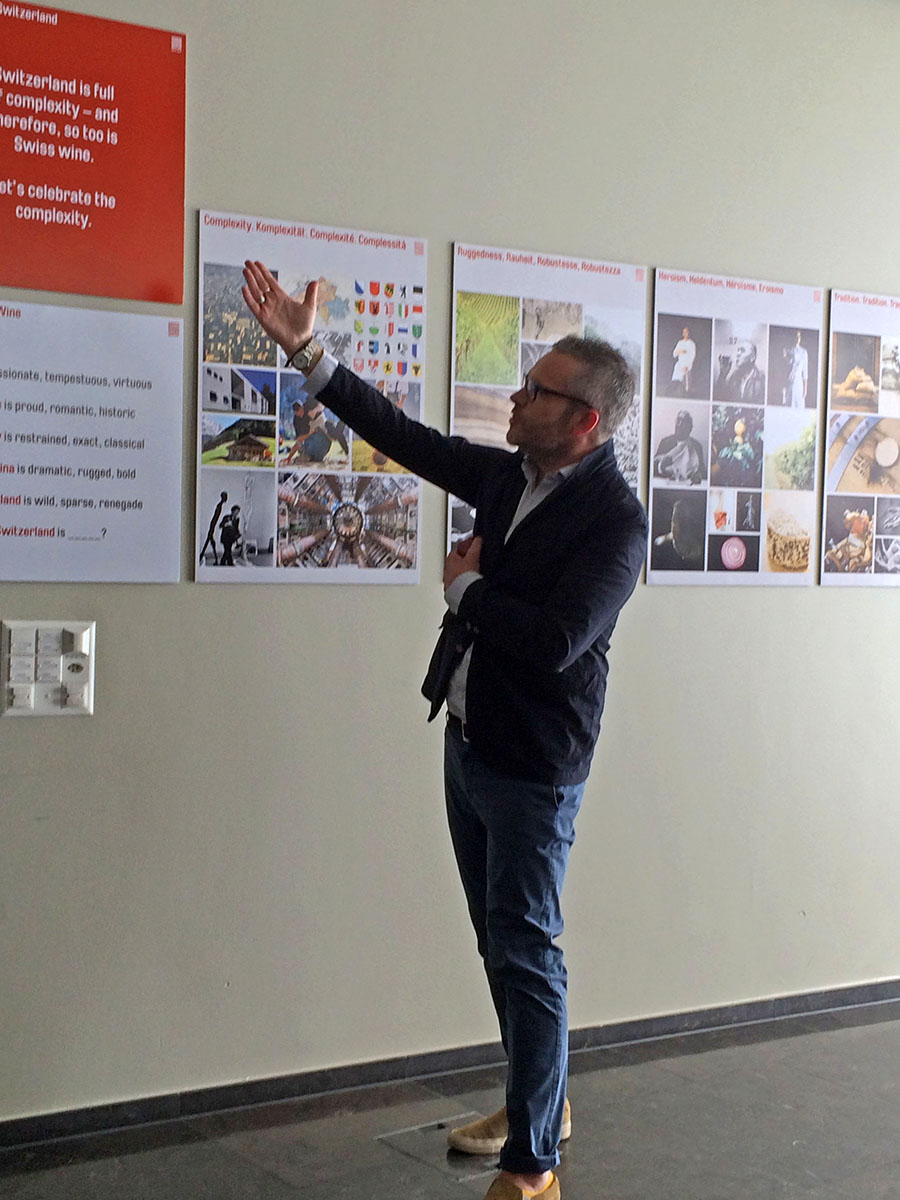
Complexity is the key word for Winkreative in describing Switzerland and wines (a plug: this is also the theme of my book on the world of Swiss wines that comes out in August so I’m pleased that we’re all excited about the same side of this business).
Given the cultural and political complexity of Switzerland, which spills over into the wine business, complexity is hard to avoid, and Winkreative is taking the approach that it’s something to celebrate – for Brûlé, “it’s ‘complex’ that gets you quality.”
The words the agency identified behind that complexity are ruggedness, heroism, and tradition, notably for handicrafts.
Here’s the lineup: Swiss Wine Promotion’s new graphic identity
 The red is darker than the red of the Swiss cross, closer to wine, and the typeface moves away from the more commonly used sans serif fonts, a choice Winkreative explained as very modern with a sense of Swiss boldness, rounded to provide a degree of warmth.
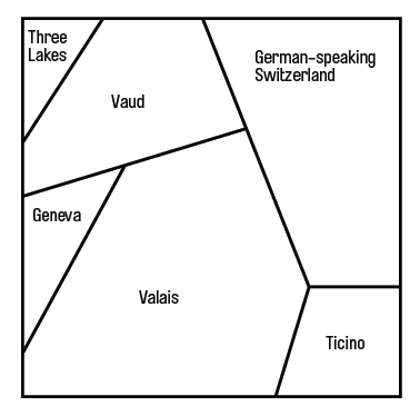 The logo itself represents the six wine-growing regions in Switzerland – and it is famously missing the Swiss cross. “We were prepared for some eyebrow-raising over this – after all, there are few symbols that convey the idea of Swiss quality so succinctly,” the designers explain. “The idea was to keep some elements of the Swiss Cross and use them in a new and sublte way. The new logo has a shape and colour that is still recognizably Swiss.”
Will the world love it? Maybe, maybe not, but that isn’t the point: it’s there to help identify and set apart Swiss wines – and that’s where Swiss Wine Production wants the love to go.
[…] SWITZERLAND – Swiss Wine Promotion’s new logo and visual identity have been out in the world for five days; I’ve held off commenting until today because good […]